Value US Sectoral Analysis
What’s Under the Hood?
May 2017. Reading Time: 10 Minutes. Author: Nicolas Rabener.
SUMMARY
- Using price-to-book (PB) or price-to-earnings (PE) results in similar Value factor performance
- Some sectors are perpetually expensive while others are always cheap
- Sector rotation is higher with PE than with PB
INTRODUCTION
In 2016 the Value factor in the US and globally showed strong performance after years of random factor performance and dedicated value investors hoped for a continuation of this trend. In this short research note we’re going to analyse what sectors were in the long and short portfolios in US Value portfolios from 2000 to the beginning of 2017, effectively having a look of what’s under the hood.
METHODOLOGY
Value can be defined in many ways with the most common differences arising from the selection of the valuation methodology and the definition of the investable universe.
Over the last few years there has been some empirical evidence that cashflow based valuation metrics produce superior performance compared to more traditional price-to-book (PB) or price-to-earnings (PE) ratios. Intuitively this make sense as PB in the US uses antiquated book value numbers, which are not particular relevant for buying or selling a company. Having said this, the investible universe can shrink significantly when using more cashflow based metrics, e.g. using EBITDA makes the Financials sector ineligible. Therefore we will use PB and PE for constructing long and short portfolios.
The investible universe is usually defined by sectors or taken across sectors. Higher Sharpe ratios are typically achieved via intra-sector factor exposure, however, often at much lower absolute returns. Given that we want to analyse the sector rotation within the Value factor, the portfolios are created across sectors.
VALUE US USING PE
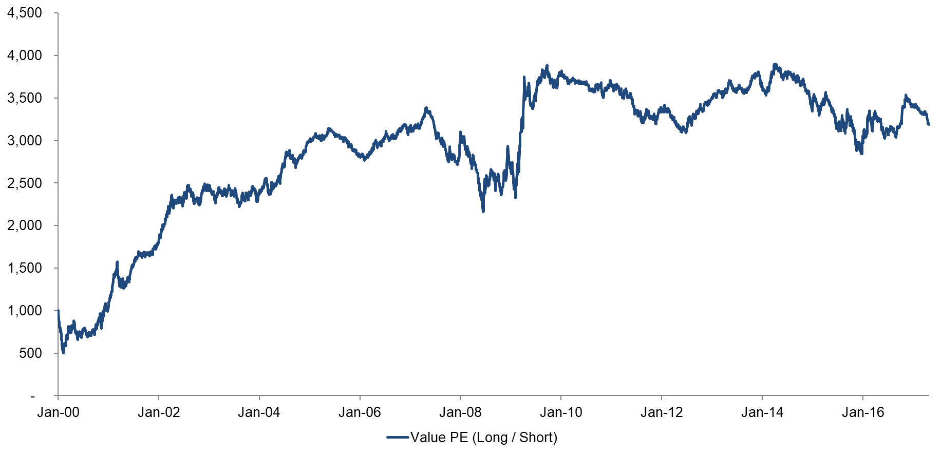
The chart below shows the performance of a long-short portfolio of US stocks selected on PE, i.e. buying cheap and selling expensive companies. The portfolios represent the bottom and top 10% of the stock universe of US companies with a market capitalization larger than $1 billion. Stocks are rotated monthly and 10bps of transaction costs are included.
The analysis starts in 2000 and the performance was exceptionally strong until 2006. The chart is somewhat misleading as the performance before 2000 was strongly negative, i.e. we’re only seeing the recovery, not the drawdown before that. Value crashed during the financial crisis in 2008, but recovered thereafter. Since 2010 the trend of Value has been slightly negative.
Value US Based on PE
Source: FactorResearch
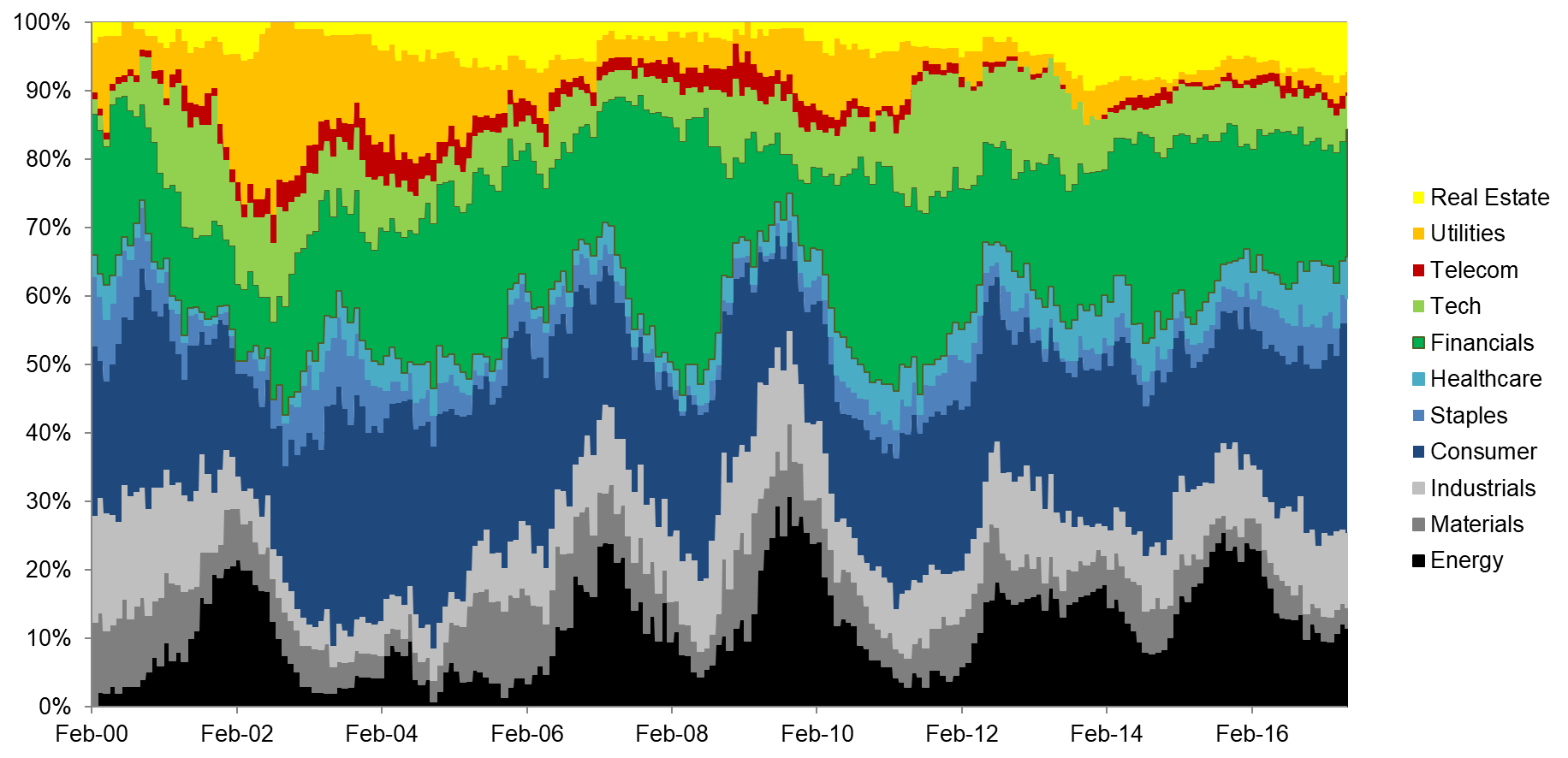
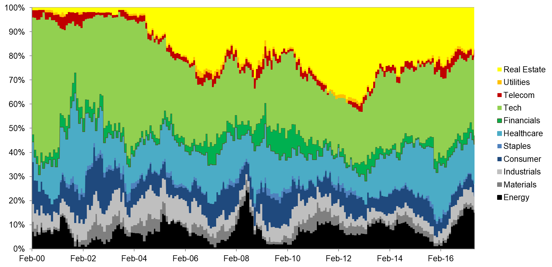
Analysing the sector exposure helps to understand the drivers of the factor performance. The most significant sector rotation took place in the short portfolio from 2000 to 2002, where the exposure to Tech decreased from 70% to 40%. The large short exposure to this sector during the implosion of the Tech bubble explains the strong factor performance in the first few years of the analysis.
Value US PE: Long Portfolio by Sectors
Value US PE: Short Portfolio by Sectors
Source: FactorResearch
VALUE US USING PB
The chart below shows the performance of Value in the US based on PB. Compared to Value based on PE, the performance is much more muted, although the shape of the curve is almost identical.
Value US Based on PB & PE
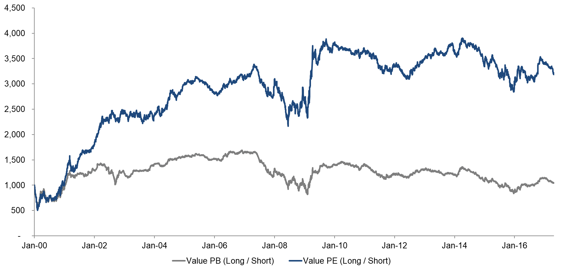
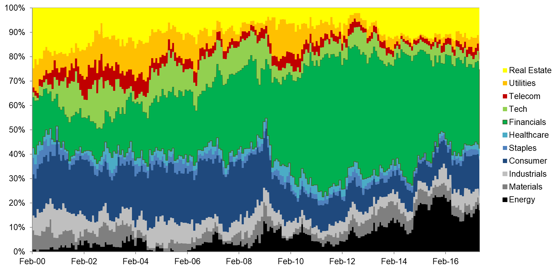
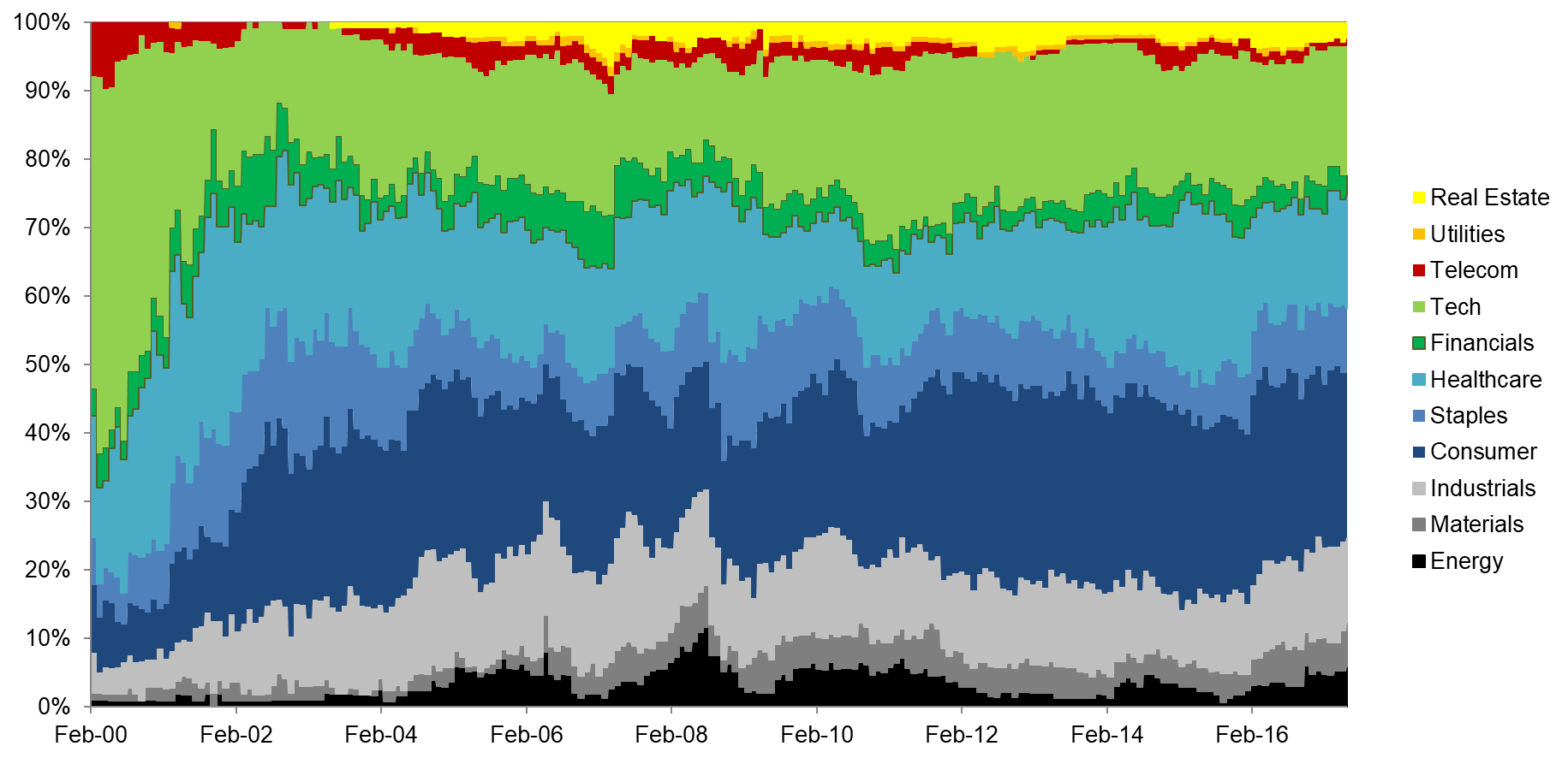
One of the reasons why Value PE might have performed stronger than PB after 2000 was that the short exposure to the Tech sector was reduced less quickly than for PB, benefiting longer from the Tech bubble implosion. An alternative explanation might be the compositions of the long portfolios, which were quite different.
Value US PB: Long Portfolio by Sectors
Value US PB: Short Portfolio by Sectors
Source: FactorResearch
VALUE US USING PB & PE COMBINATION
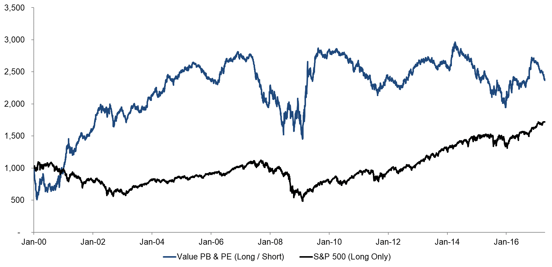
Both valuation methodologies can also be combined, which we have done by giving equal weights to each multiple and this results in a profile that unsurprisingly looks like the average of both. For mental referencing, we have added the S&P 500, although this a long-only index, so comparing it to the long-short Value factor should be done with caution.
Value US Based on PB & PE Combination and S&P 500
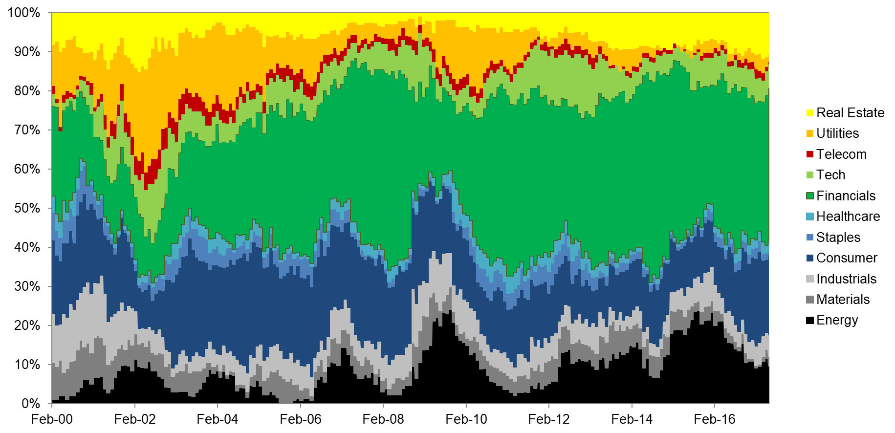
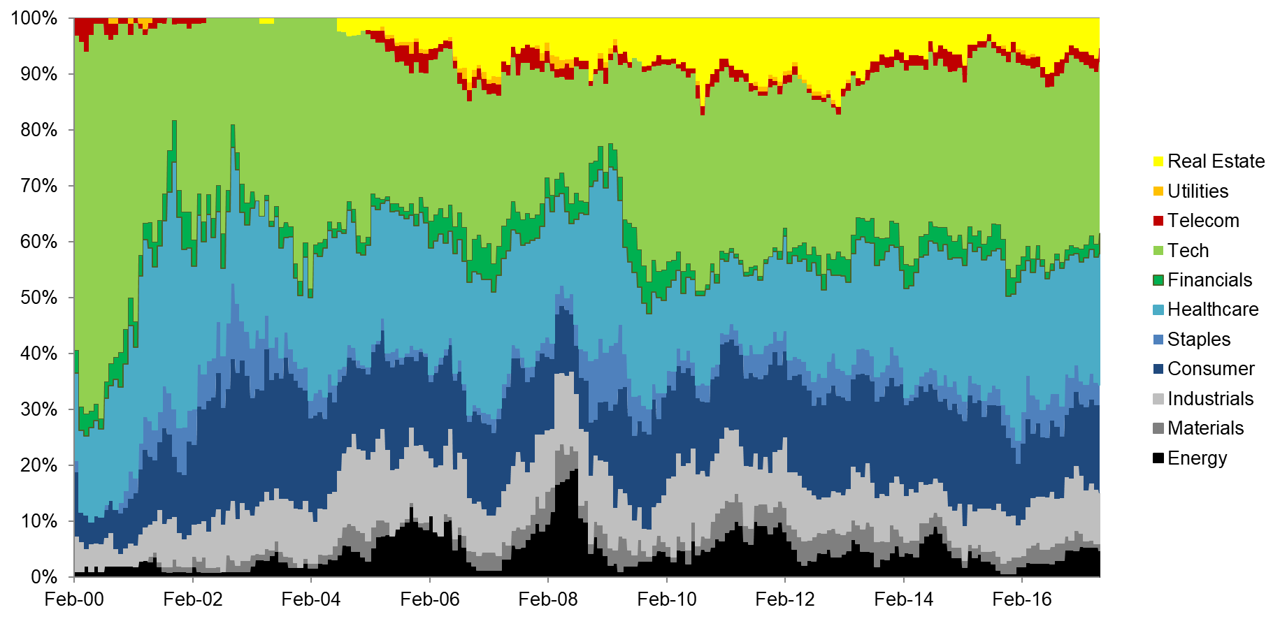
Analysing the sector exposure in the Value PB & PE combination is quite interesting. We can observe the following:
- Financials is the largest sector in the long portfolio with hardly any exposure in the short portfolio
- Utilities appear exclusively in the long portfolio
- Tech and Healthcare are almost exclusively constrained to the short portfolio
- Consumer Discretionary, Industrials, Materials, Energy, and Real Estate can be found in both portfolios
Value US PB & PE: Long Portfolio by Sectors
Value US PB & PE: Short Portfolio by Sectors
Source: FactorResearch
The analysis highlights that some sectors are perpetually expensive while others are always cheap. For some sectors this is intuitive, e.g. Tech companies tend to prioritise revenue growth over profits, which make them expensive on PE as earnings are often negative. Investors need to be aware that if they buy a value fund or ETF, they might take implicit sector exposures.
FURTHER THOUGHTS
Constructing factors across sectors leads to significant sector exposures over time, which tends to increase the volatility of the factor. However, often sector exposure is precisely what generates significant returns as some sectors become too cheap and others too expensive. We’ll explore this in a subsequent research note.
ABOUT THE AUTHOR
Nicolas Rabener is the CEO & Founder of Finominal, which empowers professional investors with data, technology, and research insights to improve their investment outcomes. Previously he created Jackdaw Capital, an award-winning quantitative hedge fund. Before that Nicolas worked at GIC and Citigroup in London and New York. Nicolas holds a Master of Finance from HHL Leipzig Graduate School of Management, is a CAIA charter holder, and enjoys endurance sports (Ironman & 100km Ultramarathon).
Connect with me on LinkedIn or X.

